
A few charts we should look at that hold significance…
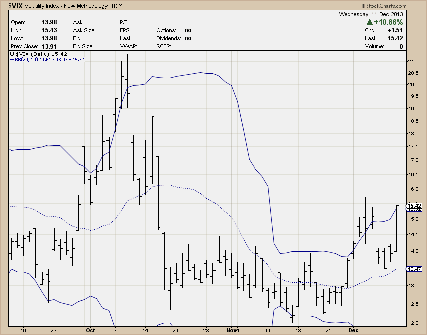
The squeeze that built up for a few weeks that I had been continuously pointing out is still firing after the VIX held the mid-point of the Bollinger bands. This tells me an increase in volatility is much higher probability.
I think this RSI issue is huge. I could have thrown up the S&P but this NASDAQ is extremely overbought, much more than the S&P & really shows the exuberance. If you didn’t read the recap over the weekend, look at this chart. That is the last time we were at these overbought levels and we were in a massive bubble.

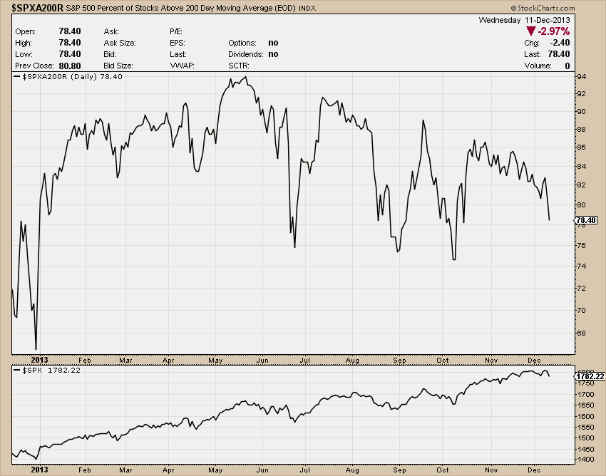
Participation is declining at a fast pace at the moment which tells me stocks are actually being sold off throughout the S&P. It’s year end after a great year, people want to lock in profits. Not only is it tanking right now, but it is tanking after it has been diverging from the market since May (SPX on the bottom).
I got this chart from @thereformedbroker blog post and he got it via Greedometer. The point is advisor sentiment is so high it is unbelievable. Look at the left of the chart and see where we were before the financial crisis. Remember how much of a bubble mindset everyone had? Ponder that for a minute.

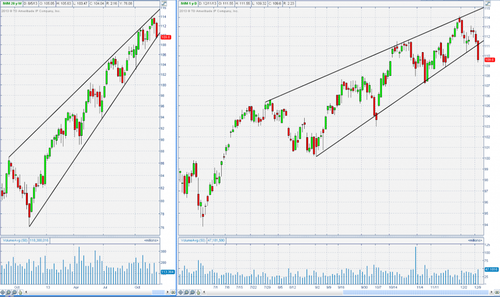
IWM the market leader for the entire year has started lagging in recent weeks and has now broken down from a wedge-ish thing it has been forming since May. It is also forming a longer term wedge-ish thing on the weekly chart. These patterns can be subjective so I make sure each line connects at least 3 points before I consider it valid.
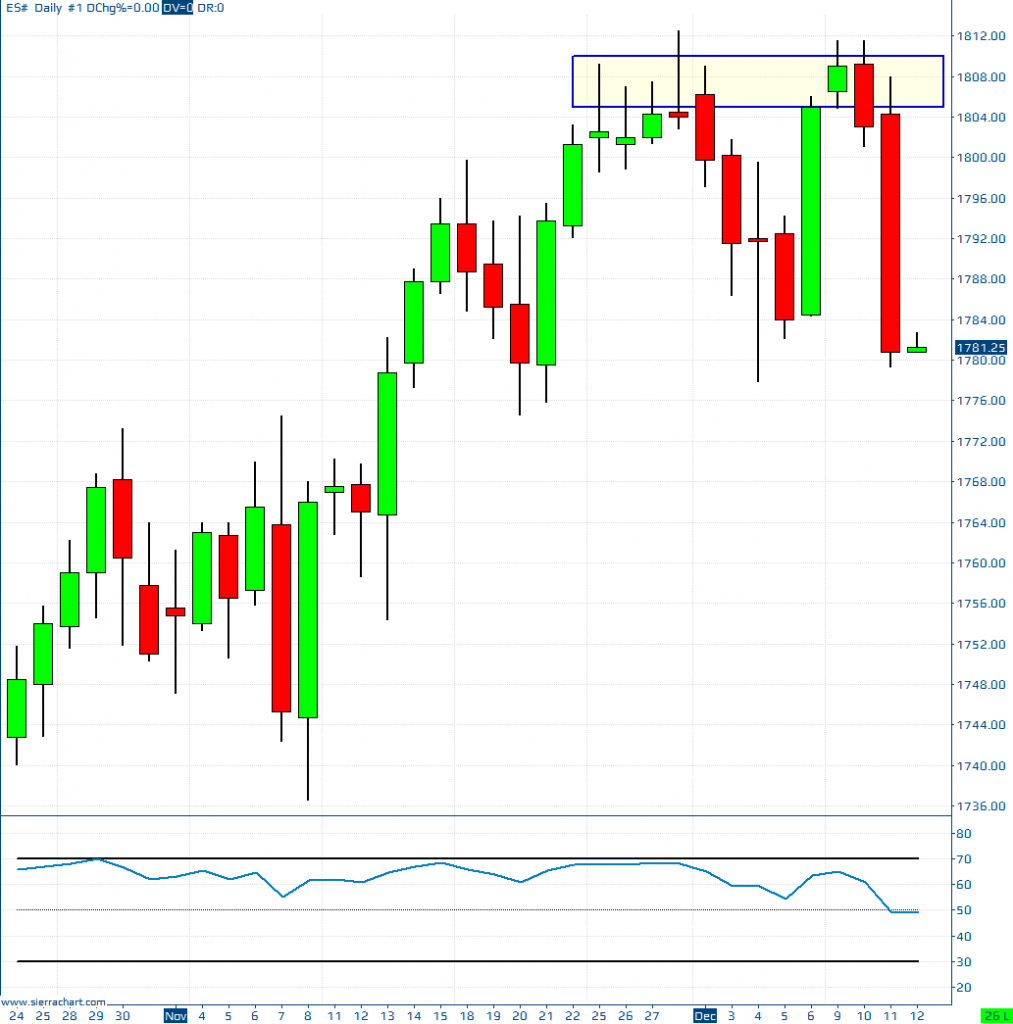
Of course, the distribution zone I have been harping on for a while now. It got some follow through so that just confirms to me even more that sellers are coming into the market at these levels, and for good reason.
This chart is from @johnkicklighter. It is showing the panic happening (or whatever you want to call it) about a December taper coming. The Fed is at serious risk if they don’t do it, although I don’t think they want to, the market may force them to. This would undoubtedly cause a Pavlov's dog response of selling.

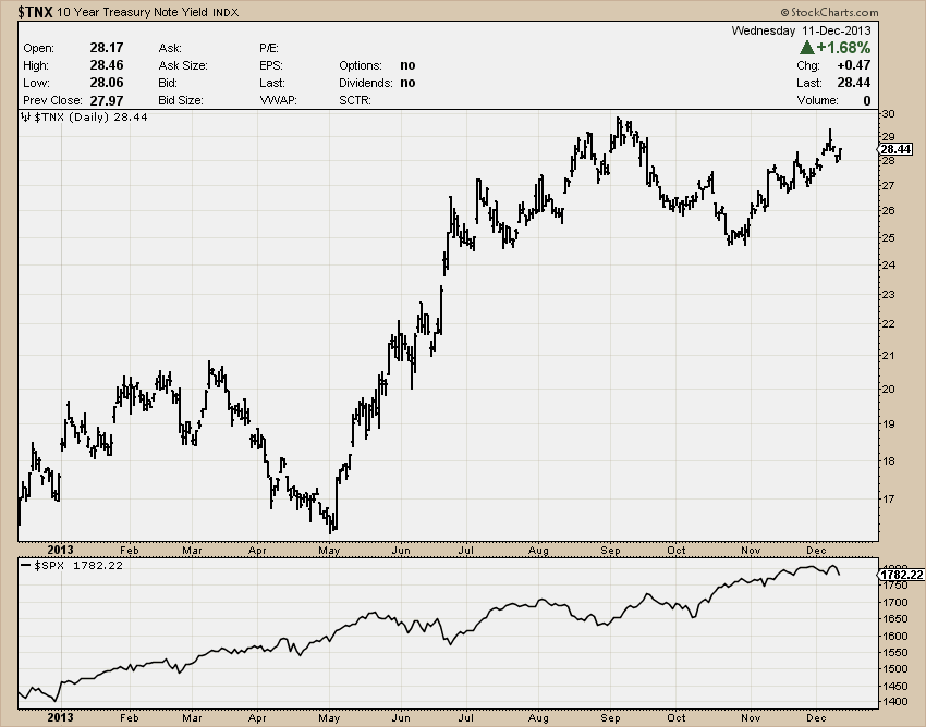
Rates are rising. Whether or not the Fed tapers next week, I think this continues. Not sure if the market can climb with rates much higher.
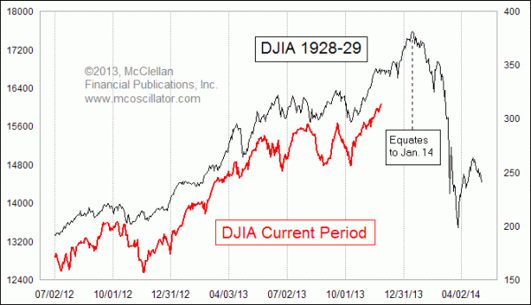
Tom DeMark put this together I believe but I found it on McClellan’s site through StockTwits. I’m not a big fan of analogs but this one caught my eye and stuck in my mind. So I figured I‘d throw this in the mix. Basically this chart is saying if we follow the same framework, as we have been doing, that we did in 1929 then we should have a significant sell off to start off the year after just a tiny bit more of a rally.
I can also understand if people are arguing that this is all one huge buy the rumor, sell the news situation. I see the rationale there. In 2012 investors were anticipating economic growth to speed up in 2014 and were buying throughout the year to get in early. Now that the gains are unrealized (possibly larger than people expected), and the news is coming out (when retail is likely to want in) professionals are now looking for a significant correction before reloading causing a self-fulfilling sell-off.
All in all, these were the charts that caught my mind over the past week or so and today I realized ‘wow there is a ton of bearish signals right now’ so I decided to post it.
So do what you do…
Hope you enjoyed it,
-Michael
